

Helen Elizabeth Kuumbi |Artist| Cornwall
Exploring painting and drawing :
Tutorials, tips and articles
Tonal Seascapes in Oil

Using a compressed value range: Tonal Seascapes
This article covers: using compressed value ranges, oil painting, creating tonal seascapes,
Using a compressed value range
Introduction
I’ve been experimenting with different value ranges to create different moods for these small seascapes (oil on canvas, 15x15cm or 20x20cm). I’ve never had the patience for your typical ‘value exercises’ (such as shading in an apple!). I find that creating these miniature paintings with specific focus on an element of design is a more rewarding way to develop my skills.
I have experimented with focusing on the different dimensions of colour; such as hue, value, temperature and saturation, and varying these within and between the paintings. Limiting the range of colours used within an artwork can be a useful way to both create effective art and develop your eye for mixing and selecting colours. Simplifying the colour palette enables me to focus on the role of value within a painting.
In this article I will show you how I create a tonal seascape by using tints of a single colour. I will also explore how using only a small range of the values can be a useful technique.


Using a compressed value range
A painting may not use the full range of values – i.e. from white to black, but have a limited range for an intended effect. For example, a close range of high-key values (light) produces a glaring, bright, energetic effect, whereas a close range of mid values gives soft moods or sense of gentle melancholy. Restricting your values to a low-key range (i.e. dark) can produce a nocturne effect, and give warmth or mystery.
In the examples below I have use one favourite limited pallets; phthalo blue, Cadium orange and titanium white. This decision was because:
-
I really like it – particularly the neutrals that can be created from it,
-
I am familiar with how the colours mix and work, therefore allowing me to focus on tone rather than colour.
In each seascape, the base mix of these two colours is the same - however I have selected a range of tints from different parts of the value scale.
Working out your values
Before working on canvas, I like to experiment with my colour mixes on paper. I mix a colour - and then create a range of tints from this by mixing with white. This creates a value scale for this specific colour. I find it useful to photograph my colour mixes (once dry) and apply a black and white filter. This helps me sea just how dark or light a colour is.
I am building a catalogue of these cards (I use postcard blanks) for reference when painting. I can compare the colours on my painting to those on the cards. In this case this comparison helps me to judge whether I cam staying within the value range (i.e. light, mid, dark) for the painting. These cards also remind me of favourite colour mixes when thinking about the next painting.

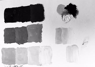

above: tints of a mix of phthalo blue and cadmium orange (leaning towards the blue hue). A range of value are achieved by mixing with white. The second card shows three possible compressed value ranges from this - a dark, mid and light option.
Another exercise I will do on paper before is to create rough gradients and mixes of the intended colour mix that I wish to use; this enables me to quickly and cheaply see how my choices go together and decide if the final painting will work. I also do this to experiment with saturation gradients, and additional colours - but I'm keeping it simple here to focus on value!


Moving onto the canvas
The first stage of my seascapes in to cover the whole canvas with a gradient. This may be from top to bottom if the painting is of the sea surface, or can be up down to meet a horizon line (block in the sky first) and then up to that same level for the sea if I am including a sky.
To create this series, I painted three gradients, using tints of the same base colour, each within a compressed range of values;
-
Canvas one: a gradient upwards from the dark mix of blue and orange (producing a colour close to black) to a mid-value mixed by adding titanium white to the previous mix.
-
Canvas two: a gradient, starting at the mid-point with a mid-tone, working downwards to a darker mid-tone, and upwards to a slightly lighter tone (but still within the mid-tones)
-
Canvas three: a gradient from a mid-tone upwards to pure white

Tips for sea and sky gradients:
-
Mix your colours first and make sure you have plenty
-
Start of by quickly getting your gradient down – use a well loaded, large flat brush and get down the main steps (it may give a stepped or striped appearance at this stage)
-
Take a dry, soft brush and gently blend the colours into each other – slowly drawing particles of one colour into the other. Switch brushes if it starts to pick up too much paint.
Ripples and waves
Whilst there was still of play in the paint, I quickly swept a flat brush horizontally across the canvas– twisting it to get dynamism in the line-shape. This creates the shapes of the ripples and waves.
To create a sense of depth, ripples and waves should get smaller (in terms of both the overall height and distance between peaks) as they move up towards the horizon line. I recommend experimenting with this on paper first.
When creating my lines, I think about the kind of energy that the sea has and direct this into the line; is it calm, undulating and smooth or choppy, energetic and angular?
I have applied lessons that I learned from gesture drawing to how I approach the natural world: being mindful of the movement, feeling this in my own body and directing it towards the canvas.


Frowns and Smiles
I add in what I call ‘the smiles and frowns’. This is not my original term for these but I cannot remember who told me to be able to credit them – apologies! The slightly darker ‘frowns’ are the areas beneath the falling waves or the side of the ripple. The lighter, reflective ‘smiles’ are in the cups between peaks. These reflect the colour of the sky – so should be lighter areas of sea, but still slightly darker than the sky itself.
Working into the wet paint, I adjust the value and blend as I go. During this process pay close attention than usual at how much I lighten or darken an area to ensure that the whole remains within the original value range I had decided on, and also that it makes sense in terms of the value gradient.


Once the first layer is dry enough to work on...
When the first layer is touch dry when I go back to the painting. I look at whether I have kept the values within the ranges I had intended, and make adjustments where areas needed lightening, or darkening. For example, darkening the vertical faces of the wave using a glaze, adding highlights.
I step back from the canvas to see the how the values work across the painting as a whole. They should still work in the same way as I approach any landscape with regards to where the lightest and darkest tones are:
-
The sky should be the lightest area
-
There should be a gradient of darkest to lighter as the scene recedes towards the horizon
-
Focal points work best where there is a significant contrast.
Thinking about the focal points, I might some subtle new elements ; a moon, a breaking wave, foam, sun sparkle. Here I create a stronger contrast in value, but not outside the range.
This final part of the process is mostly intuitive – to bring the painting together. This for me involves quite a lot of standing back and moving forward for one or two dabs and stepping back to look again


1) Sea foam has been added at last stage by twirling a thin brush across the surface, well loaded with a much lighter colour than the underlying one
I2) A dab of a moon and its reflection gave this scene more interest, notice how I have not used pure white.
3) A breaking wave was added to create stronger geometry in the painting.
If you have found this article valuable please consider donating a small amount to help continue developing and writing these guides
If you are interested in booking Helen to lead a drawing workshop for your group, please get in touch (Cornwall/Plymouth area)
